Home › Forums › Chart Support › Show a colored region in a scatter chart › Reply To: Show a colored region in a scatter chart
@eshan_23,
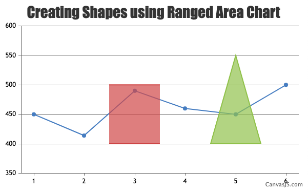
You can use Range Area chart to create shapes in the chart & fill it with desired color by setting color property in dataseries level.
Please take a look at this JSFiddle for an example on the same.
— Adithya Menon Team CanvasJS