Login to Ask a Question or Reply
Home › Forums › Chart Support › Display only integer values for ticks › Reply To: Display only integer values for ticks
1) If series start not from the same data-point position and use label approach you suggested, then label displays not correctly
https://jsfiddle.net/tn2u0650/32/ but if adds empty elements as stub for missing points then chart looks good https://jsfiddle.net/tn2u0650/31/
You can use x-value along with labels to align all data-points based on x-values properly. Please take a look at this updated JSFiddle.
2) If set interval to 1 then chart looks bad for big range, for instance if we have 800 items than all range from 1 till 800 will be displayed on X-asix
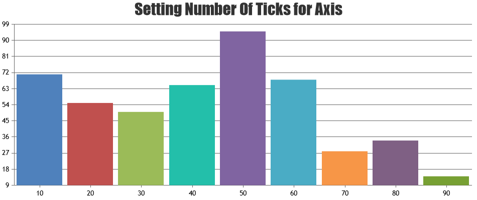
Calculation of axis interval depends on various factors like axis-minimum, axis-maximum, number of labels that can be shown within that range of axis, length of axis etc. When you set interval to a value, it doesn’t auto-calculate instead accepts the value that you have assigned irrespective of range, number of data-points and length of axis. You can either remove hard-coded interval so that it will be auto-calculated or you can calculate based on range, number of ticks as shown in this JSFiddle.

—
Vishwas R
Team CanvasJS