@jmedlock,
Could you please share the image again, as the link shared seems to be broken?
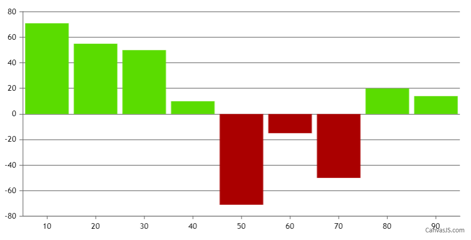
Also, the color is different for the columns rising up vs those dropping down.
You can change the color of column using color property of dataPoint as shown in the code snippet below –
function setColor(chart){
	for(var i = 0; i < chart.options.data.length; i++) {
  	dataSeries = chart.options.data[i];
  	for(var j = 0; j < dataSeries.dataPoints.length; j++){
    	if(dataSeries.dataPoints[j].y <= 0)
      	dataSeries.dataPoints[j].color = 'rgb(170, 0, 0)';
    }
  }
}
Also, please take a look at this JSFiddle which shows setting different colors to positive and negative values.
—
Ananya Deka
Team CanvasJS
.