@mahsa77,
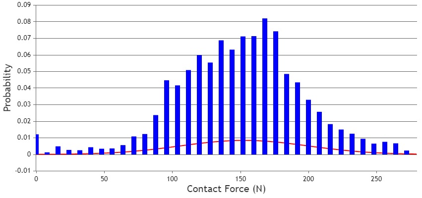
In the example you shared, the chart displays a line dataseries and a column dataseries with reduced width. This is happening because of the large difference in the number of datapoints between the line and column dataseries. The chart automatically reduces the width of the columns to accommodate datapoints from both series in the plot area.
You can use the dataPointWidth property to set a fixed width for the column chart. Please check this updated JSFiddle for a working example.
—
Thangaraj Raman
Team CanvasJS
.