Login to Ask a Question or Reply
You must be logged in to post your query.
Home › Forums › Chart Support › Show a colored region in a scatter chart
Show a colored region in a scatter chart
- This topic has 16 replies, 2 voices, and was last updated 3 years, 5 months ago by
Adithya Menon.
Tagged: Scatter chart
-
September 12, 2022 at 3:52 pm #39087
I have a scatter chart, which shows different points.

Suppose I want to shade a particular region in the chart, the region can be any shape that can be drawn over a chart, given in this pic-

The region can be any polygon with a given number of sides for eg- for a polygon with sides 5 I’ll be having an array with objects like- {x1: 3.2, y1: 0, x2: 7.8, y2: 3.9}, so there will be 5 lines like that for all sides. Can someone please let me know if its possible?
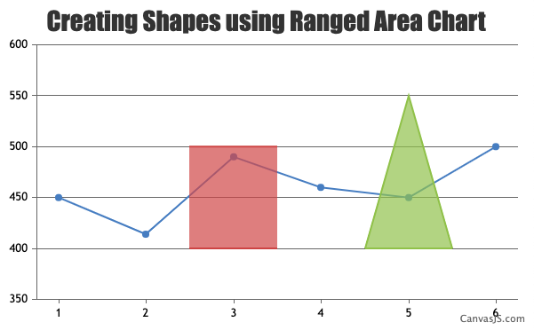
September 13, 2022 at 2:46 pm #39113You can use Range Area chart to create shapes in the chart & fill it with desired color by setting color property in dataseries level.
Please take a look at this JSFiddle for an example on the same.
—
Adithya Menon
Team CanvasJSSeptember 14, 2022 at 4:29 pm #39122@adithya Thanks so much, this was helpful. But my use case is having the ability to draw polygon, the examples were for rectangle and triangle but I can’t understand how will I send values for dataPoints for a polygon. I tried experimenting with dataPoints but can’t understand how they’re making shapes.
September 15, 2022 at 4:47 pm #39127You can use Range Area chart type and provide the datapoint values as x and y coordinates to create shapes like triangle, rectangle etc. Similarly, you can provide your own set of x and y coordinates as datapoints and draw polygons on the chart as shown in this updated JSFiddle example.
—
Adithya Menon
Team CanvasJSSeptember 16, 2022 at 12:49 pm #39134Hey @adithya-menon actually I understood this approach, but the one limitation that seems obvious to me is that I cant make points connected if they don’t have a high or low value, for eg, in your example 5 and 5.5 are in same line with high and low value on y-axis 400,550. suppose they are not in straight lines, and are in arbitrary positions where we can’t have a low and high value for the x value.
September 19, 2022 at 6:43 pm #39147You can use Area chart type or Range Area chart type to create polygon shapes on the chart. Since you are using arbitrary points which don’t have a range of values, you can use Area chart type as shown in this updated JSFiddle. Duplicating the first datapoint at the end of the datapoints array will close the area chart to create a shape that you can customize according to your requirement.
—
Adithya Menon
Team CanvasJSDecember 8, 2022 at 9:20 am #40167The above example helped me, and it was a good solution. I have observed one bug/abnormal behaviour though. As long as area chart has less than 250 datapoints, it works well. But when it has more than 245-250 points, the area curve plots very very weirdly. I’m attaching an example jsfiddle- JSFiddle
When I randomly remove datapoints, and trim them to be kept below 250, then it works.
December 8, 2022 at 11:58 am #41368Kindly fork/save the JSFiddle and share the link with us so that we can understand your scenario better and help you out.
__
Adithya Menon
Team CanvasJSDecember 14, 2022 at 9:56 am #41474@adithya-menon here’s the example JSFiddle- JSFIDDLE
December 20, 2022 at 8:33 pm #41720@adithya-menon did you looked at this? Is it a bug or am I doing something wrong?
January 3, 2023 at 5:55 pm #41853To form a closed shape using area chart, the datapoint must be in a sequence making an enclosed shape. It seems like after a certain datapoint, the rest are not in a sequence making an enclosed shape. Kindly take a look at this updated JSFiddle which shows till which datapoint the charts seem to be rendering fine. Having a sequence for the rest of the datapoints should work fine in your case.
__
Adithya Menon
Team CanvasJSJanuary 3, 2023 at 10:31 pm #41856@adithya-menon, I confirmed it by changing chart type to line type, the points form an enclosed shape. Even if I randomly remove the points , trimming the number of points to be less than 250, it works well. The area chart makes the desirable shape.
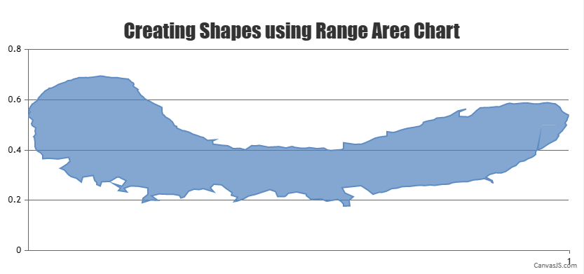
Also I have used 3-4 set of datapoints till now, they all break if they’re greater than 250 points.January 5, 2023 at 10:16 am #41869You can use a Range Area Chart type instead of an area chart for your scenario. You can use Range Area to fill the region by splitting the datapoints, from the value to an arbitrary point and removing the border of the area chart since you are using an arbitrary point. To have the border you can use a line chart type with the same datapoints. Please refer to this updated JSFiddle for an example on the same.
__
Adithya Menon
Team CanvasJSJanuary 9, 2023 at 2:45 pm #41889@adithya-menon this approach looks good, but there’s a weird spike in y=0.4, on right hand side, which shouldn’t be there. Also is that a bug with area type chart? The issue of more than 250 points?
January 11, 2023 at 11:24 am #41921As per your requirements you can use the Range Area Chart type. Area chart will not fit your current requirements due to the way it is designed.
The spike appears due to the y-values. Kindly take a look at this updated JSFiddle, where the spike doesn’t exist. You can further improve on the example by changing the y-values accordingly.
__
Adithya Menon
Team CanvasJS
Tagged: Scatter chart
You must be logged in to reply to this topic.